For a while I have wanted a solution that would rotate table column headers on web pages. In Excel or Open Office Calc, this is a breeze. However, the only way to do it in todays browsers is using images, or perhaps SVG or even the Canvas element from the HTML 5 spec. However, this is a pure design issue, and therefore falls into the domain of CSS. And I think that I've come up with a solution, or at least an idea for a solution.
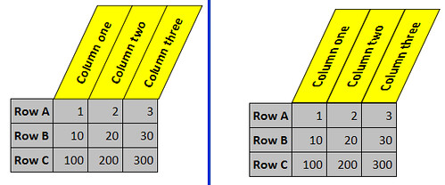
The image above should give you an idea about what I mean. The benefits of this design is that one can keep all columns relatively narrow, while at the same time use long words to describe them in their headers. If you use Firefox 3.5 or Safari 4.0 or another browser that supports -moz-transform or -webkit-transform you can also look at my experimental page. View its source to get the full picture of what I have done.
The technique
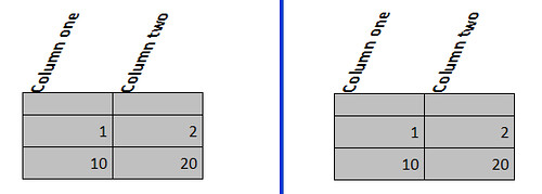
One can not simply rotate the th-elements. It will look like this:
There is a number of problems:
- The rotation is applied after the browser has allocated width for the columns. Our intention was to save horizontal space. We need to remove the text content out of the normal flow, using absolute positioning.
- Any borders and background color will not be rotated. The text will extend out on top.
My solution is to wrap the text in three spans. Yes that's an awful lot, but they each serve a purpose. The first span is the holding area, relative to which the second span will be absolutely positioned. Its CSS is as follows:
    th > span {
      position: relative;
    }
The second span is rotated as well as skewed. Rotation is counter clockwise, hence it's set to a negative degree. The skewX is set so that the border originally to the left, now to the bottom, is completely horizontal. Mathematically the formula is abs(rotationdegree) + skewdegree = 90.
In order for all headers to be of equal height, we set a width. Remember that the visible height is the un-rotated width. For some yet un-investigated reason Firefox will put the span a bit further up than Safari, so I'll add a CSS filter to fix that. Border and color is added, as well as some padding, just for the appearance.
th > span > span {
  /* Must remove span from normal flow in order to keep columns from widening */
  position: absolute;
  white-space: nowrap;
  top: 1em; /* Firefox 3.5. Safari is reset below */
  -moz-transform: rotate(-65deg) skewX(25deg);
  -webkit-transform: rotate(-65deg) skewX(25deg);
  -moz-transform-origin: 0% 0%;
  -webkit-transform-origin: 0% 0%;
  border: 1px solid;
  padding: 0.5em;
  height: 1.3em;
  width: 120px;
  /* Illustrate where it's at with color */
  background-color: yellow;
  /* If one wants centered text, this is the place to reset it */
  /* From a design point of view it might not be desirable */
  text-align: center;
}
/* CSS filter for Safari */
@media screen and (-webkit-min-device-pixel-ratio: 0){
  th > span > span {
    top: 0;
  }
}
The text will be a bit hard to read. I therefore un-skew it in a third span. This does not work, however in Safari 4.0 beta:
th > span > span > span {
  /* Rotate the text back, so it will be easier to read */
  -moz-transform: skewX(-25deg);
  /* Safari 4.0 beta won't skew back, so the next line is actually redundant right now */
  -webkit-transform: skewX(-25deg);
}
For the full HTML and CSS, look at my experimental page and view source.
Problems
- This solution is quite fragile. Widths and heights, margins and paddings might mess things up. Columns must not be of a flexible width.
- For pixel perfection, there is a slight nuance, where Firefox positions the spans 1 pixel further to the right, than Safari.
- As I said, there is an awful lot of spans...
- And worst of all. So far I have not developed a fall back for browser that do not support CSS transformations. In those the table will just look awful and the table headers will be unreadable.
Anyway, I think this solution has some potential. Until the CSS WG and browser vendors gives us an even better solution, this is my best effort. Is there a better solution somewhere, please let me know!

Hello, I read your posts on the Web Dev list. Here is another approach which I'm sure is IE-only:
ReplyDeletehttp://home.roadrunner.com/~bmerkey/examples/nonscroll-table-header3.html
Hey, this is really great. It's true - in Open Office Calc it shouldn't be a problem, but I tried doing this for Safari and got stuck. So, thanks for posting this, I'll give it a try! :)
ReplyDeleteLars,
ReplyDeleteIf you set the span with the text in it to "position: absolute;" then it will pull it out of the context of the previous span and become unskewed.
Thanks
this one works fine in all browsers - http://www.useragentman.com/tests/cssSandpaper/rotateTest.html
ReplyDeleteThis is really brilliant - I'd been trying to do this all day, and your method works brilliantly for me. Thank you for sharing it.
ReplyDeleteI found your post via Google, along with another.
ReplyDeleteI guess this one is a bit more up to date http://s-church.net/Blog/Entry/464