Update May 3, 2012. Demo link fixed. + Firefox 14+ (Aurora, Nightly) no longer skews text.
Apparently the CSS Working Group have recently decided that Webkit behavior was better and Mozilla has fixed
their code. I think this was a bad decision, but that is how things stand.
Other stuff seem to be happening in the CSS WG with regards to skew and I have unfortunately
been unable to keep track of this. Note that skewX does not seem to be in jeopardy, though.
A little more than a year ago I wrote about a technique I have developed to rotate table column headers. (If you have not, you had better read that article to understand this one correctly.) Back in May 2009, this could be done in Firefox 3.5 and Safari 4. Now browsers have evolved and it's doable in all major browsers, except Internet Explorer. So, with Firefox, Chrome, Safari and Opera all supporting this, has the time arrived to use this on production sites?
The sad answer is no, there are still a few issues to that needs to be sorted out in my opinion. First of all, one really can not ignore Internet Explorer, and even if we can rotate content using -ms-filter, that is not an optimal solution. I have also seen reports that these filters will not work in IE9 in its strictest standards mode. Removing them, while not adding CSS transformation, gradients and a few more things, will make it near impossible to achieve true cross platform effects. I hope that won't be the case, though. (More thoughts on this in my conclusion.)
Updates to my code
The full demo is at keryx.se/lab/rotating-th/rotate-th-2.html
Today I revisted my code. The first thing I did was simply to slam on -o- prefixed rules, identical to all -moz- rules. The result looked like this. Click the image to see it in full size.
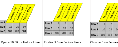
Not nice. Firefox, Opera and Chrome (the 3 browsers I could test on my Linux driven Thinkpad) all got the horizontal position differently. Admittedly, Chrome got a slightly different rule, thanks to a Webkit CSS filter. But this worked as intended in my tests one year ago. My code was largely experimental and not really calculated anyway, so I was not surprised that it broke. It was intended as a proof of concept, not as production ready code.
Before I started to investigate the differences in earnest, I tweeted, and soon Faruk Ateş chipped in and had some helpful thoughts. First we removed my line "top: 1em" for all browsers. Note, that it must be removed. Manually setting it to 0, will still mess things up in Firefox. I suppose that's a bug, since the calculated value is 0 with that line removed…
The line that was removed:
th > span > span {
    …
    top: 1em;
    …
}
Stability issues
Next problem, subpixels. I had used the em unit to set heights and widths. But 1.3em is not the same in all browsers. In my code it's 23.4 pixels in Firefox, but only 23 in Opera and Chrome. The latter two does not translate ems into subpixels. At least not on Linux and Windows. So I made some changes to the code, to use pixels almost everywhere.
th > span > span {
    …
    padding: 9px;
    height: 23px;
    width: 120px;
    …
}
td {
    padding: 5px;
    text-align: right;
    width: 36px;
}
All values above were set in ems in my original version. Now I was getting close to a working version. There was one thing that bugged my designer eye – and I am really not a designer. The line in between table columns did not align perfectly with the column header lines in Firefox. Once again, this was a sub-pixel problem. So I added this rule, explained in the comments:
th > span > span {
    …
    position: absolute;
    left: -0.5px;
        /*
          So far only Firefox does subpixel positioning =
            ignored by Opera, Chrome and Safari.
          But they got this right (visually) in the first place.
          This rule puts the rotated span exactly in place for Ffox
          (tested on Linux and Windows July 2010)
        */
    …
}
Should Opera and/or Webkit add support for subpixel positioning, it is my hope that it will affect their rendering just like it does in Firefox. But this is a fragile hope!
Webkit text skew (not a) bug
Update May 3, 2012. Firefox 14+ now treats text the same way as Webkit.
To make the text as legible as possible it is skewed back to being non-skewed. Let me explain. There are three spans. The outermost is simply an anchor for the middle one, where the real magic happens. That span is rotated and skewed. That leaves the text a bit… skewy(?) To remedy that, I use a third span, only used to skew the text back again.
th > span > span {
    …
    -moz-transform: rotate(-65deg) skewX(25deg);
    -o-transform: rotate(-65deg) skewX(25deg);
    -webkit-transform: rotate(-65deg) skewX(25deg);
    -moz-transform-origin: 0% 0%;
    -o-transform-origin: 0% 0%;
    -webkit-transform-origin: 0% 0%;
    …
}
th > span > span > span {
    /* Rotate the text back, so it will be easier to read */
    -moz-transform: skewX(-25deg);
    -o-transform: skewX(-25deg);
    -webkit-transform: skewX(-25deg);
    /*
      Safari and Chrome won't skew back, so the above
      line is actually redundant right now
      (checked July 2010 on Linux and Windows)
    */
}
I suppose this is a Webkit bug, that needs to be filed. This image illustrates the problem.
The red line shows the actual angle of the stroke in the letter "l" (small "L").
The green line shows what angle it was supposed to be.
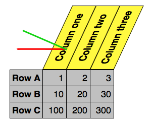
Screenshot of my table from Safari on a Mac, graciously provided by Matthew Irish. This problem affects all Webkit based browsers, on Windows, Linux and Mac.
Opera text blurriness and zoom bug
Opera gets the skewiness
right. (Being a non native English speaker, I love the word
skew
and will jump at every opportunity to skew it!) However, Opera looses
the smoothness of the text, once it has been rotated. It will look blurry. The following image
compares Opera to Firefox. The text is not perfect in Firefox either, though.
An even bigger problem with Opera is that it really will mess the text up when zooming the page, to the point where it becomes totally illegible. The image below is zoomed to 300 % and one can not read the text at all, since the bottom (=left) margin has widened and pushed the letters on top of each other.

Gaps between cells in Firefox
The image above illustrates another problem in Firefox, perhaps also
caused by subpixel positioning. At some zoom levels small gaps appear between
the cells
. Note that we are not drawing lines on the actual table cells
but a box around the edges of a span. We are just visually emulating
rotated table headers.
From previous testing I also found these gaps also when not zooming the page. One has to be really precise in the measurements to fix this. Right now I basically get the visuals right by having the line from one cell on top of the line from the previous cell.
If I'd fine tuned my technique, I think these gaps could be avoided. Not drawing both lines both left and right (= top and bottom in CSS) and extending the top (= right) line a bit might do the trick.
On subpixels
A small aside: It might seem like subpixel positioning is all bad. I believe it generally is a feature, not a bug. I wish all browsers could agree on Firefox' behavior. But in this context it seem to be problematic. I will ping a few people at Mozilla and see what their take on this is.
Conclusions and some thoughts about the future
Please see the top note about things being unstable in CSS WG, when it comes to skew.
I really think there should be a CSS-rule that would make this super easy. Rotating column headers is a really common technique in spreadsheet programs like Excel and LibreOffice Calc. I use it all the time. It would be a great feature for Google and Zoho Docs and similar on-line products. So far, however, the CSS Working Group and browser vendors have shown very little interest.
All browsers display an issue of some kind with my current technique:
- Killing: Bad rendering of the text in Opera, especially when zooming.
- Bad: Gaps in Firefox between the
cells
, when zooming. - Slightly annoying: Skewed text in Safari and Chrome (and probably Firefox 14+).
Internet Explorer 9 is a big question mark. My current idea is to capability detect for CSS transforms and replicate this behavior in SVG, if available, or using -ms-filter as a third option. That should cover all bases = MSIE 6-9, Firefox 3.5+, Opera 10.51+, Safari 4+ and Chrome (always at the latest version, at least until it comes to the corporate environment – a subject worthy of a blog post by itself).
Having to limit oneself to pixels as a unit and fixed width for the columns is a major obstacle. For this reason, as well as the Internet Explorer problems, I think that the only sane way of doing this at the moment and the foreseeable is using JavaScript. Perhaps this could be my first official JQuery plug-in. (Please feel free to beat me to it!)

the demo link doesn't work. Can you please put that up again?
ReplyDeleteFixed the link + warned about changed behavior in Firefox.
ReplyDelete